
Shinjuku JR station is the O’Hare Airport of my youth, a never-ending construction project migrating from section to section in an endless loop. Japanese train stations like Shinjuku and Tokyo are never truly finished. Maybe that’s a good thing but I avoid both unless absolutely necessary.
Going down the platform stairs at JR Shinjuku the other day I did a double take because the signage looked like simplified Chinese characters not Japanese Kanji.
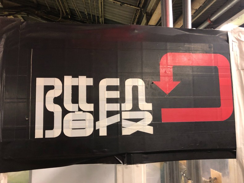
On closer inspection they are Japanese kanji but very funky kanji made with tape instead of being drawn. The signs are in a construction area and obviously temporary. The font design appears to be in the ‘Tensho‘ style, highly stylized kanji designs based on ancient Chinese characters used for seals. And tape signs.
Even for a temporary station sign, it’s a very odd design choice. Perhaps the tape material forced the construction worker’s hand but the fonts display flair and creativity in a pinch. Check them out if you happen to be in Shinjuku JR station, they will not be around long.

Update: a reader send a link to a Japanese article profiling Shuetsu Sato, the construction site guard who creates the signs at Shinjuku station with regular gum tape you can buy anywhere. It’s a common technique in the countryside used at school fairs, festivals and anyone can do it, but Sato san’s signs caught the attention of a few Tokyo city writers. Catching people’s attention is exactly the intention as people are basically walking in a construction area.
You must be logged in to post a comment.